What do you imagine when you think of your YouTube channel's brand image? If nothing solid comes to mind, you may be missing out on an opportunity to get more views and subscribers with your channel art. A strong brand image is achieved by creating beautiful, cohesive channel art. This article aims to introduce you to ten of the best design tips proven to make your channel stand out among the millions of creators on YouTube.
Whether you're creating channel art for this first time or giving your channel a face lift, these tips will be indispensable for getting the job done. Let's learn more about channel branding first and then dive into our top-rated design tips.
Did you know...
"Approximately 65 percent of the population is visual learners, and 90 percent of information that comes to the brain is visual." - KydiamS | studymode.com
This is why branding (the visual representation of your channel) is so important if growth is your goal. Using the right images or photos, banners, backgrounds, fonts, etc. will make a huge difference if you know how to skillfully put it all together.
What is channel branding? Why is it important?
According to YouTube, "Your channel brand is the set of unique characteristics that separates your channel from the rest and communicates your key messages and content strategy."
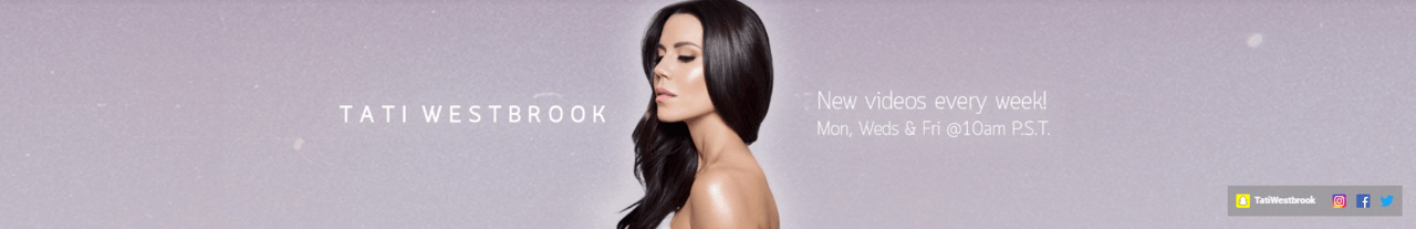
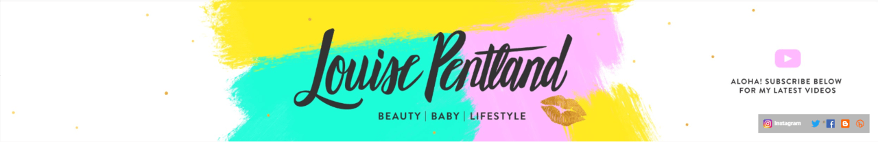
See two examples below of channels that have a strong brand image.
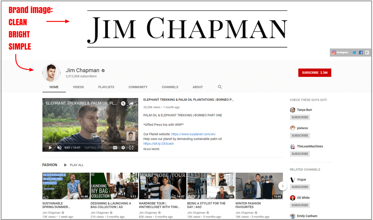
Example 1 - Jim Chapman
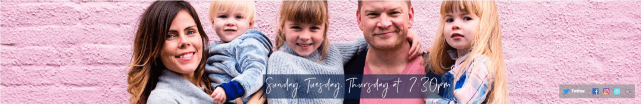
Example 2 - Safiya Nygaard
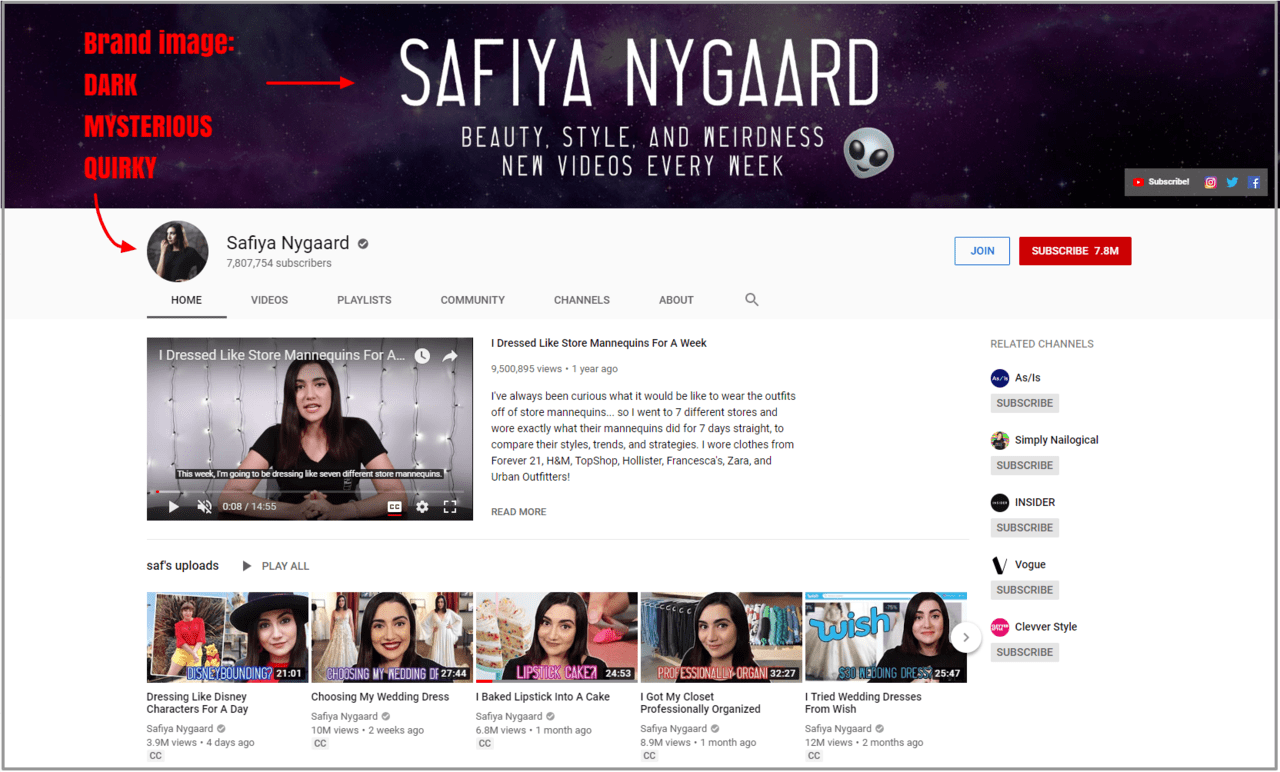
Notice the following three important points about the branding of the above channels:
- They prominently feature their name (or channel name) across the center of their channel banner. This means their brand name will jump out at you and stick in your mind even after you click away.
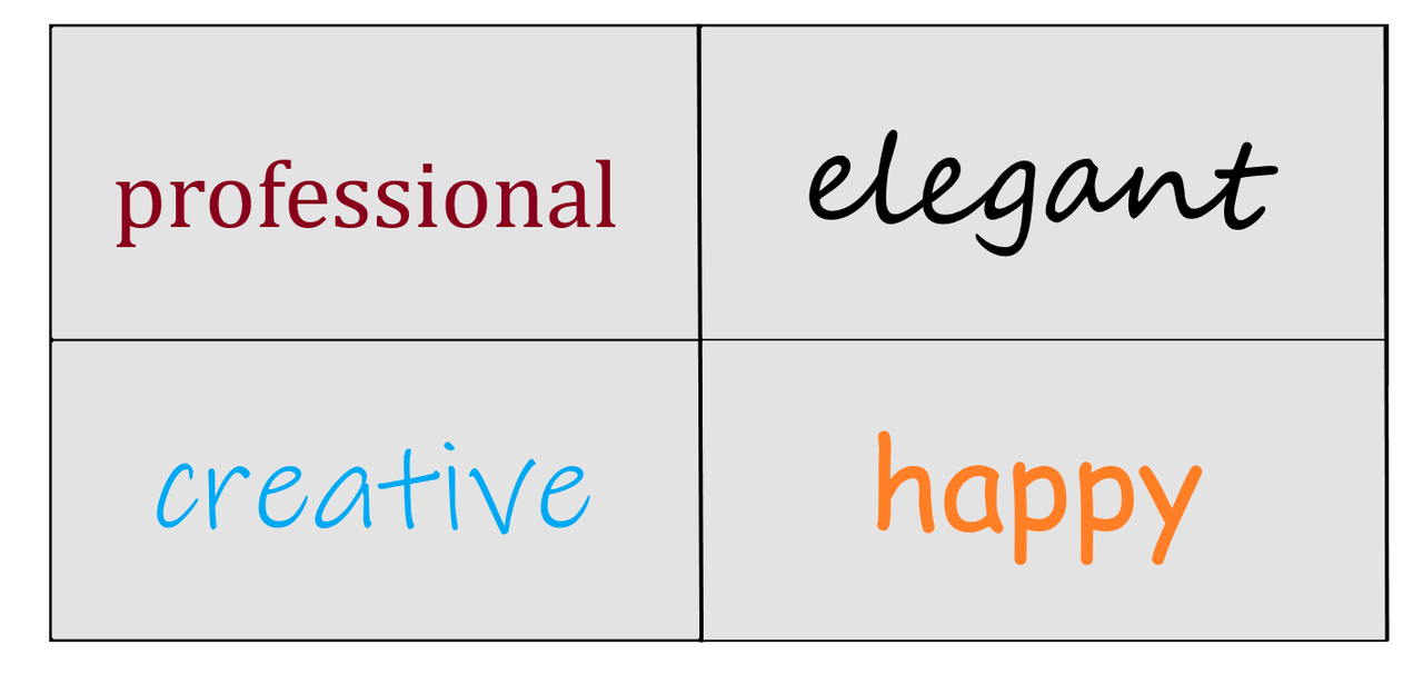
- It's very easy to identify the themes of their branding, such is "quirky" in Safiya's case or "clean" for Jim's channel. You should be able to summarize your brand image in three words.
- Their thumbnails match their channel art design. This is high-key important, so don't forget about your thumbnail design! They are part of your brand image too. When viewers take a look at your channel, they should be able to understand your brand concept from just glancing at your video thumbnails.
Design Channel Art for Growth & Views: 10 Creative Tips :
1. The Right Dimensions
Before you get started on your design, you'll need to ensure you're using the right banner dimensions. If you don't know the dimensions YouTube specifies, then you may end up working hard on a design just for it to look blurry in the end.
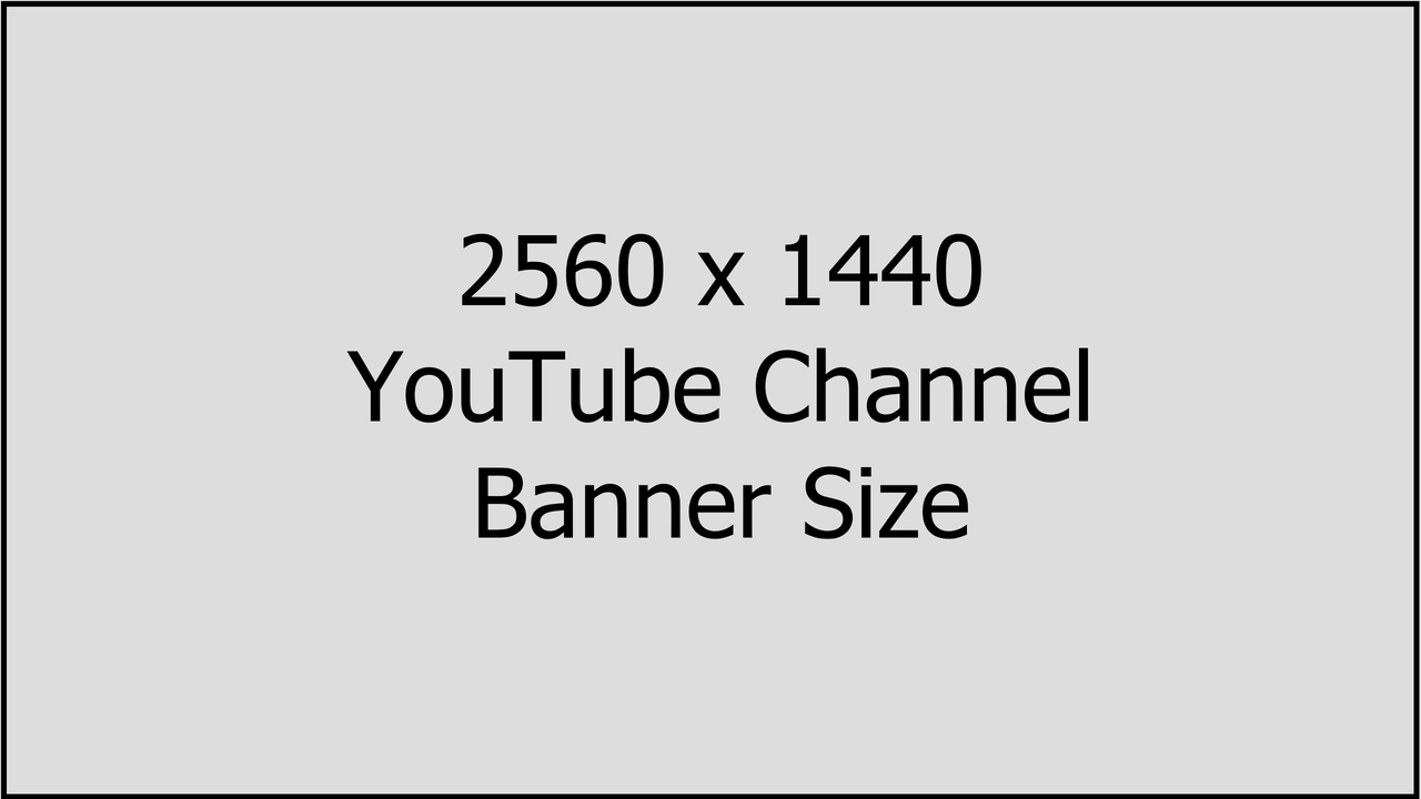
Banner Dimensions
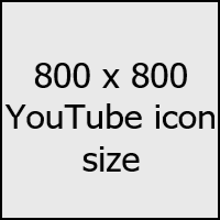
Icon (Logo) Dimensions
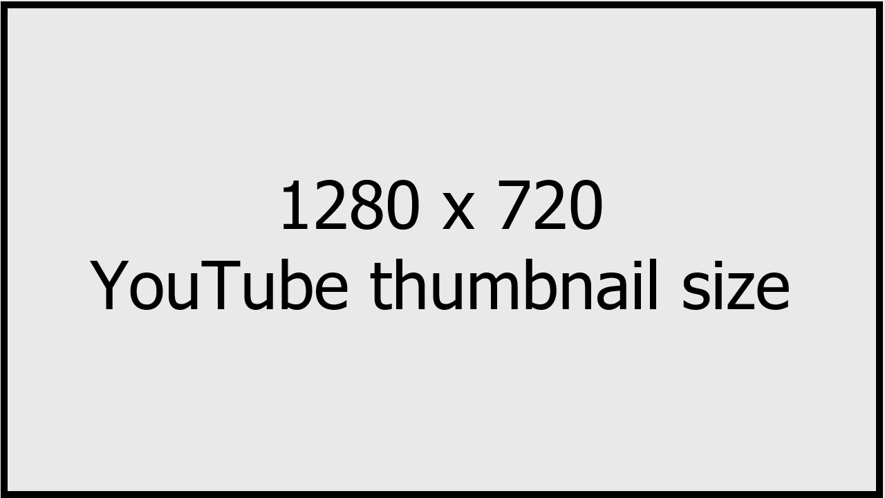
Thumbnail Dimensions
2. All About the Layout
The way you choose to lay out your channel banner will say a lot to viewers about the type of channel you have. Believe it or not, the position of images and texts can change the whole mood of your channel!
Tip: When you're designing your channel banner, play around with the layout. Move the text around and see if the image looks better centered or off to the side. Each different layout gives the design a new feeling, right?
See below for some layout examples to help get your head around the importance of positioning for a channel banner.
Balanced
The image is centered, and the font is evenly balanced to the left and right of the image. This gives a clean, minimalist feeling to the banner.
Front-and-center
The bold placement of the font definitely leaves an impression. This banner is vivid and the brand is right in your face, giving a sense of pride to the channel art.
Asymmetrical
The tagline in this banner is set off to the side, producing an asymmetrical effect. The channel feels simple and friendly.
Scattered
We have a little bit of everything in this scattered design. The banner feels fun and outgoing - giving a sense of excitement to the viewer.
Which one was your favorite? There are even more ways to lay out a banner than what's shown above, so we recommend browsing around YouTube for more ideas!
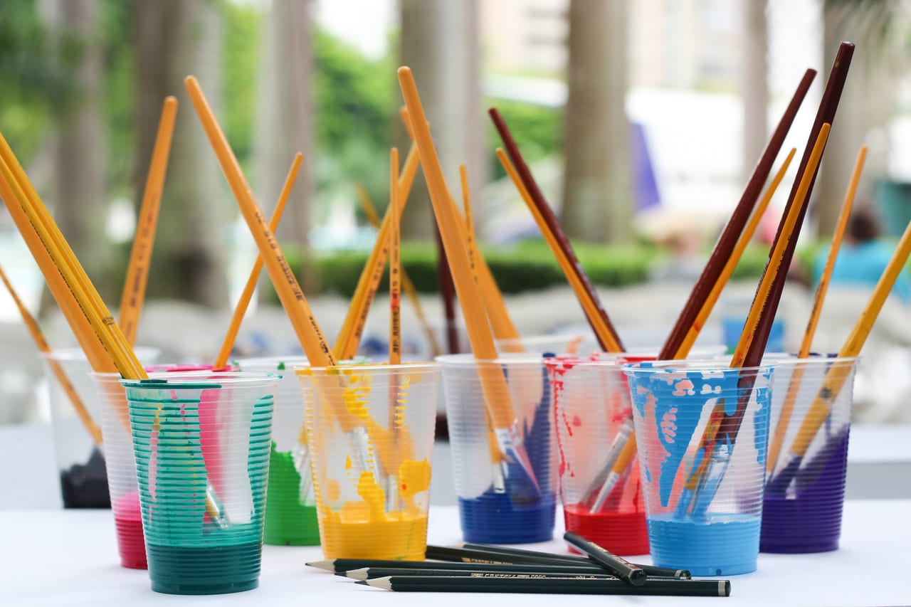
3. Image Criteria
Trying to choose an image for your banner but drawing a blank? We've got you covered. There are a few of points you'll want to consider while making your decision.
Point 1
Use clear images. There's nothing worse than a good layout, well-chosen font and a distorted image. We recommend using a website like Unsplash for stock images if you won't be using a personal image.
Point 2
Don't use vague images. Although we recommended stock images above, be careful when choosing because many stock images are too vague. Choose an image that gives viewers a clear hint about the content on your channel. Otherwise, it's recommended simply to use your own photo to leverage your personal brand - you want people to know and remember your face.
Point 3
Add an outline. Most YouTubers know about this technique for their thumbnails.
Adding an outline makes an image stand out more and grab the viewer's attention.
The reason the outline is so important is because it helps viewers easily see the main content of the thumbnail. This is especially true for mobile users who have smaller screens!
Point 4
Color correct. We are all really familiar with photo filters at this point with the popularity of image sharing apps like Instagram. We recommend using a filter to color correct your image if you're using a background or font color that doesn't match perfectly with the colors in your image. You don't want anything to clash in your channel art. If your background and font use blue hues, then we recommend putting a blue filter on the image you'll use. Below are two examples of beautifully color corrected images in banner art.
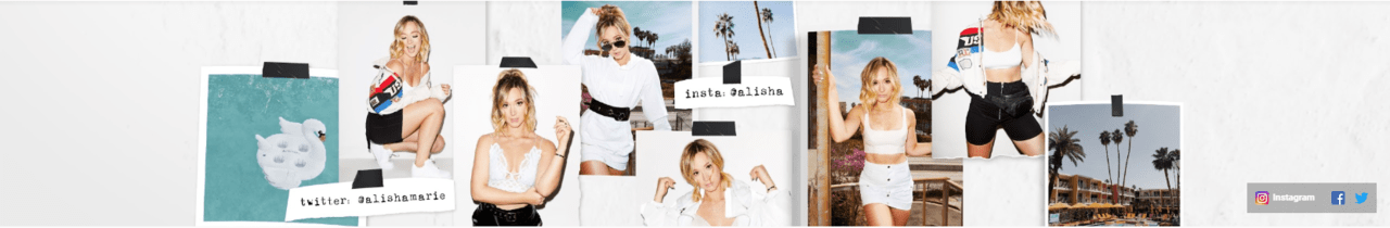
Explanation: All her photos have a high-contrast, bright filter applied so that the entire banner has a sense of unity despite there being multiple pictures. Bravo!
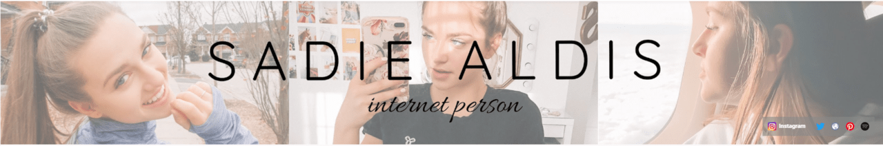
Explanation: Although these are three different photos, they have a cohesive appearance because a pale filter has been added over top.
4. Give Them a Tagline
A tagline is a short line of text that explains your channel to viewers. Many popular YouTubers choose to add a tagline to their channel banner. There are a couple different ways to pull this off. See below for our suggestions on what to include in a compelling tagline!
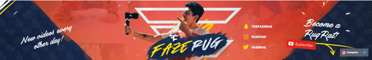
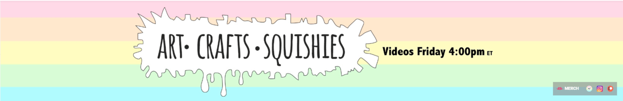
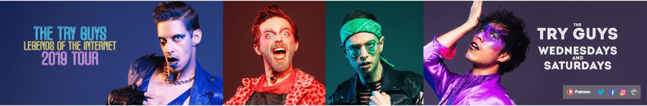
- Tell viewers your upload schedule. It's common for taglines to read something like this: "Uploads every Tuesday & Thursday at 8 PM EST". If you have an upload schedule you can stick to, then add it to your tagline!
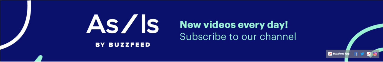
- Add a call to action. CTAs or Calls to Action are usually a very short request for viewers to do something. Usually the action you request is for them to subscriber to your channel. You can simply add a subscribe button to your channel art with the text "Subscribe!" and that will serve as an effective CTA for a tagline.
- Give them a bite-size preview. A tagline could also have a quick summary of the different topics your channel covers. For example, if you own a cooking channel, your tagline could read "Healthy eats & Cooking on a budget". Make is short, sweet and to the point.
5. Be Choosy with Fonts
The wrong font can seriously spoil an otherwise good design. There are two approaches we recommend for choosing a font:
1. Choose a font according to the type of video you made. So if the video is funny, choose a fun-looking font - nothing too serious or blocky. You'll want to choose a matching font for each video you make.
2. Keep the font the same across all videos. This means falling in love with one font and sticking to it. The only issue with this method is that if you make a very different type of video, for example, if your videos are usually funny but you release a serious video one day, then the font you use might not match. A way around this is to choose a neutral font that will match any type of video!
Font examples
From the above font examples, it's probably pretty easy to understand how different fonts can evoke different emotions.To learn more about some common font types and their descriptions, see the below infographic. Understanding fonts more deeply will help you make better choices when you design your channel art!
Source: Crazy Egg
6. Consider a CTA
A CTA, or Call to Action, means a request to viewers to carry out some kind of action. For YouTubers, there are a few different types, such as a request to watch another video or like a video.
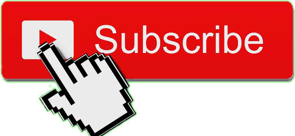
For your channel art, however, there's one type of CTA in particular you should be using: the "Subscribe!" CTA.
Asking viewers to subscribe can be achieved within a video, but not all YouTubers take advantage of one of their largest advertising spaces - their channel banner. Of course it's obvious why you would want to ask viewers to subscriber - more subscriptions equals a better shot at monetizing your YouTube channel, for instance. But did you know that subscribers are valuable for many different reasons? For example, they tend to watch videos longer than non-subscribers, increasing the average watch time of your videos a great deal.
So as you can see, a "Subscribe!" CTA is an important addition to your channel banner. We suggest adding it alongside a subscribe button such as the one pictured below.
7. Color Matters Too
Because humans are so highly visual, we also pay a lot of attention to color. Brands devote loads of time to choosing color schemes for their products, and you should be dedicating time to your channel's color scheme too!
Just like font, colors evoke feelings from viewers. This is why it's so important to choose three keywords for your channel's theme and stick to them in all design aspects. If you chose the keyword ""happy"" for your font style, for example, then your colors should follow suit, being light and cheerful.
Below we've collected a few different channel banners to demonstrate how colors can change the feeling of the artwork.
Compare these...
Light & playful
Pastel colors are light-hearted and suitable for channels that want to leave a cute or innocent impression on viewers.
Dramatic
Bright primary colors like reds and greens are a little risky to work with, but in the above banner they are used with finesse. These colors can be used for a variety of channels, but just be careful how you combine them so you don't overwhelm the banner with color.
Polished, professional
Navy blue tends to look professional. This is similar to any dark or muted color such as a deep green or burgundy. Use these kinds of colors for channels dealing with business, news, or other genres in the professional realm of YouTube.
What other color combinations can you think of?
Consider how the colors affect your mood and decide carefully how you want your channel to come across to viewers.
If you're struggling to come up with a combination of colors, check out this useful color combination guide for inspiration!
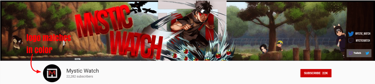
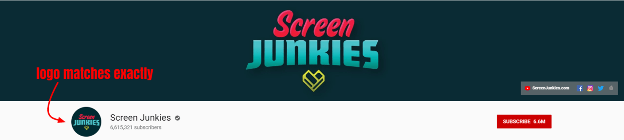
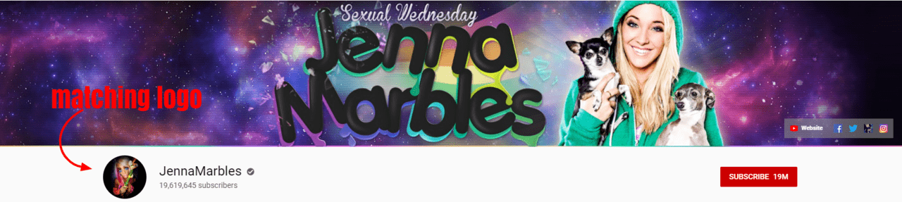
8. Design a Matching Logo
As we've said before, you'll develop a stronger brand image if it's consistent. We strongly recommend matching your channel logo (icon) to your channel banner and there are a few ways to do this.
Match the logo with color. Use a similar color scheme for both your banner and logo.
Match the logo exactly. Basically your logo is just a smaller version of the image used in your banner.
Match the logo abstractly. This means that the logo and banner are related generally in their design, but they are not identical. See the example below if you're confused. Jenna Marbles' logo has a similar quirky vibe to her banner.
Our recommended logo maker: Placeit
We tested out a bunch of logo makers so you don't have to! What we found was that a lot of them just didn't offer enough variety in style to really satisfy our needs. However, Placeit impressed us with their interactive editing and selection of stylish logo designs.
9. Remember Your Thumbnails
There are three points you'll want to be sure you understand ahead of time in order to design the best possible thumbnails. For a full write-up covering all aspects of thumbnail design, including the tools you should be using, check out this savvy article, "How to Create Better Thumbnails for Getting Views on YouTube"!
Point 1: Tools
We've rounded up our favorite thumbnail design tools so you can spend less time searching for design tools and more time actually designing! See the full list below along with a short description of each tool.
Canva
Offers designers over a million design options including font, graphics and photos.
Picmaker
No designing skills required! Over 100,000 graphic elements and 700 templates are available on Picmaker.
Adobe Spark
Claims to make it easy to design social graphics such as channel art or thumbnails. Offers free templates.
PicMonkey
A photo editing tool available online and in app form. "PicMonkey's mission is to empower everyday creatives to communicate visually."
Snapseed
A photo editing app owned by Google but available for iOS and Android. Considered a professional style of editing app.
PixelLab
An app for adding text to images - great for designing thumbnails in a hurry. Easy-to-use interface.
Point 2: Dimensions
The YouTube thumbnail size you want to be using is 1280 x 720 pixels. So, 1280 pixels is the width and 720 pixels is the height. Keep in mind that the ideal ratio for a thumbnail is a 16:9 aspect ratio.
Point 3: Consistency
Create a brand image and stick to it! This means using the same thumbnail design across all videos. And it's important for these thumbnails to match your other channel art, such as your channel icon and banner. They should all evoke a similar feeling, so think carefully about how you want to portray yourself to viewers before choosing a design theme.
10. Know Your Design Tools
Canva
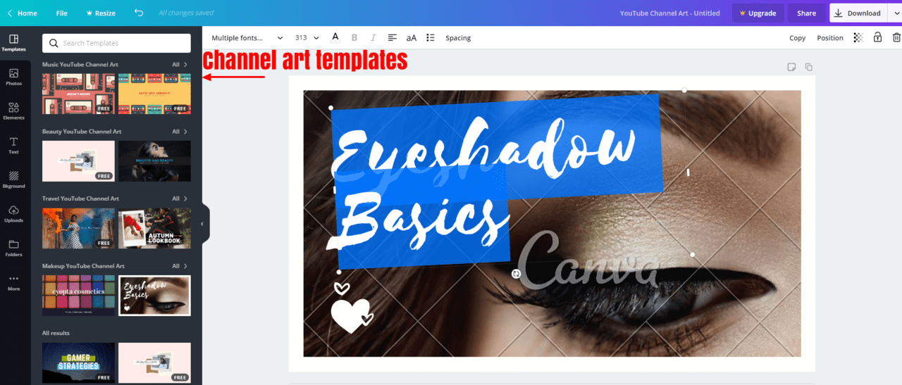
Canva is YouTube's personal recommendation for channel art design. According to YouTube, "Canva is a popular resource for making banners."
Canva is a graphic design tool website with 1 million+ photos available to users. With Canva you can make any design a reality. It's the classic, most popular channel art tool - so we recommend starting with Canva, but if you find it's not really your thing, then check out the below resources for some alternatives.
Fotor
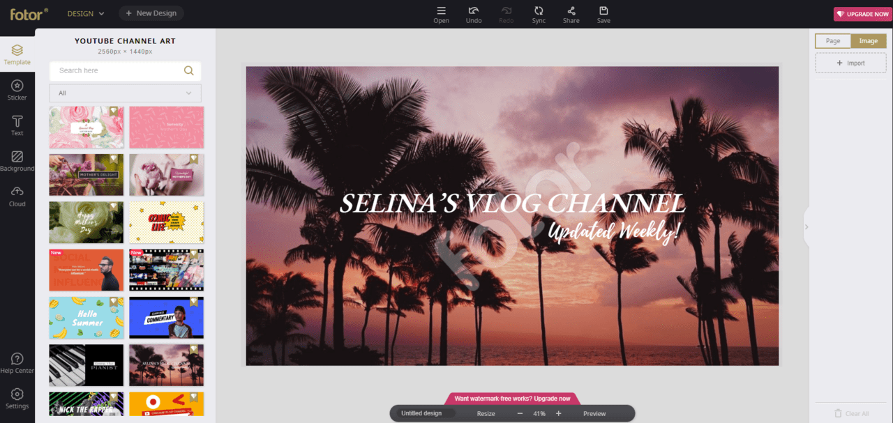
Another popular option, Fotor grabbed our attention with its sleek user interface and professional looking templates. They have an editor made specifically for creating YouTube banners, and they claim that "Fotor’s YouTube banner maker is able to convey a range of elements, enabling you in effortlessly communicating the feelings you wish to express on your YouTube channel."
They seem to cover all their bases when it comes to design tools, and it's an easy-to-use tool that anyone could learn to use quickly. The only downside is that Fotor will add their watermark to your designs unless you use free templates or upgrade to Fotor Pro (8.99 USD/month).
Snappa
Snappa allows you to use templates or create channel banners from scratch. Their templates are all very basic and simple but easy to edit for a personalized touch. We love that Snappa uses guidelines in their editor to show you how the banner will appear to PC users vs mobile users.
The entire website is really no-nonsense, with very few distractions or overly complicated tools. This is great for beginners! We recommend Snappa to anyone who wants to design a very minimalist style banner without a bunch of frills.
11. What We Learned

We hope you enjoyed learning about channel art in this article. You should have a good understanding of what it takes to make compelling artwork, so go out there and design something amazing!
Transforming your channel art will boost your channel's stats in more ways than one. Before you start gaining subscribers or vying for views, you should make sure your channel is branded and looking its best!
For similar articles that will teach you even more ways to get more views and subscribers, check out the articles linked below!